May 29, 2016

WET PAPER STAMPING

As a Stampin' Up! demonstrator, we are treated to luscious magazines called Stampin' Success. Back in the day, we received these little gems frequently. Nowadays, not so much. But, they remain wonderful resources, both for improving your business, updates on the company and products, but, best of all, lots of great ideas for using the products, i.e., PROJECTS!

I was leafing through one of my oldies but goodies from October 2010, when I ran across a technique that appeared to be quite intriguing: Wet Paper Stamping. I decided to give it try right then.


These are the actual directions on how to do the Wet Paper Stamping technique. Remember though that these instructions are from way back in 2010 when we relied on our Stamp-A-Ma-Jigs more.

But, NOW, the technique becomes ever so much easier with the advent of clear photopolymer stamps. It is so simple to just realign the stamp over the original stamped image since you can actually see where you are stamping!


OK. It said to DAMPEN the watercolor paper. I think I may have taken "dampen" just a bit too far in my first try. Linda, they said "dampen" not drown. Oops.


Misting it with a much lighter hand gave better results. I think that if I had done a better job stamping my second image, I would probably have used this try:


The previous attempt still showed lots of excessive feathering -- in my mind anyway -- so, on my third try, I simply MISTED the watercolor paper. This gave much better results.


I had stamped my original image on the wet paper with one of the new In Colors, Sweet Sugarplum. I then came in with my final stamping on the dried paper in Rich Razzleberry. 


To carry on with the Sweet Sugarplum a bit more, I gently sponged the edges of the watercolor paper in that color, and added a strip of Sweet Sugarplum cardstock underneath the sentiment label. I had embossed the strip with the Elegant Dots embossing folder, the first time I'd ever used it. When using it on such a narrow strip, I was struck by how much it resembled Braille. I know that makes no sense, but, that's me. There you have it. To remedy my perceived problem, I simply added a large Basic Pearl to the center of one of the "Braille" circles. Even though I am not perfectly happy, it is an improvement.


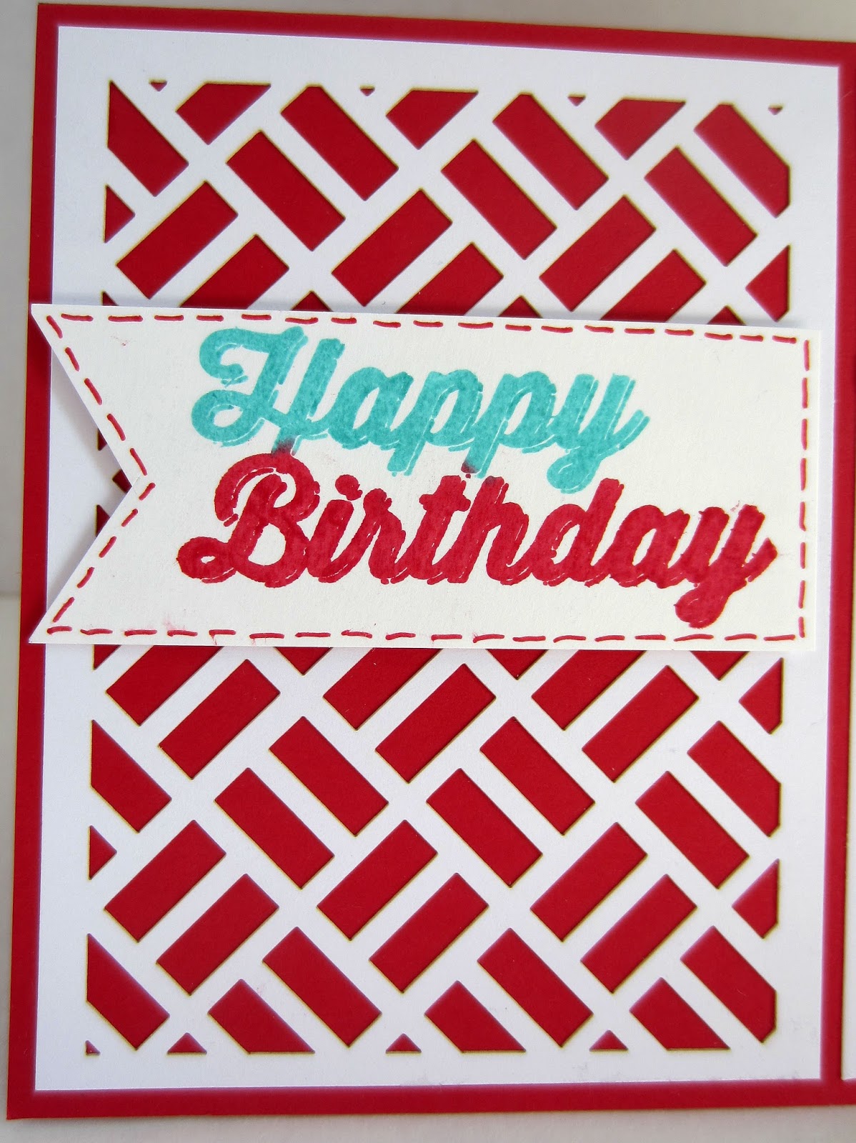
And, here is my final card. 


I love trying new techniques, and my adventure with Wet Paper Stamping was no exception. Maybe it is just the image I chose to experiment with, but I discovered I'm not terribly crazy about the effect, and am not sure I will try it again. 

What are your thoughts?

Wet
Smiles.

May 27, 2016

BEAUTIFULLY SAID: FAITH IN HUMANITY


P.S. While I make mostly cards, this is not one of them. All of my Beautifully Said pieces are stand alone artwork, suitable for framing. Prints of any of the pieces are available for purchase. This particular one measures 8" x 10".

THE SMALL PRINT: This is my original artwork. Please do not print it out. For any other uses, please ask for my permission. Thank you for your respect.

Faithful
Smiles.

May 25, 2016

STRIPED REFLECTIONS

Well, I must admit that this card was a whole lot more fun to create than to photograph!!! I don't think I've ever been so challenged in taking photos of a card.

About a month ago, I held a special class in which my participants created all the projects in the Tin of Cards (pictured on the front cover of the catalog which will be retiring on May 31). 

Before the class, I put together the kit myself, just to see how long it takes to complete everything so I knew what the duration of the class should be. After I finished putting together my kit, I had lots of supplies left over for future projects. Yay!

One of the cards featured a striped front made up of gold metallic paper. In preparation for creating this card, the maker needed to punch out the in-between metallic strips. As I'm sure lots of people would do, these punched-out strips would probably go into the garbage. But, not me! I saw them as supplies for something else.

Recently I came upon that pile of leftovers from my kit, and tried to decide how I could  best use some of those gold shiny strips.

I LOVE the small-flowered washi tape that came with the Botanical Gardens Suite. I thought the alternating of gold strips and washi tape would be an effective background for a card. So, I proceeded to carefully cover a scrap of cardstock with six strips of each.

Because I wanted to preserve the integrity of this nifty piece, and not cover up just too much of it, I opted for a simple flower and diecut greeting. 

And this is the card I ended up with:


Being that the metallic strips are highly reflective, I had a terrible time trying to get a good photo of it. I'm still not satisfied with what I ended up with, but it is the best I could do. On most of the photos, I, along with my red camera, were reflected in each and every photo. Grrrr. 

Below is a fairly clean photo -- at least, no reflections are present. The metallic strips look fairly flat and without personality though.


In trying to come up with a good paper choice for the sentiment, I opted for the reverse side of one of the matching Designer Series Papers that are part of the Suite.


Another glimpse of what, in real life, is a beautiful card. The presence of a few reflections at least give the feeling of it being metallic.


So, are you one of those who simply tosses all the leftovers from any kit you put together? Or do you gratefully and excitedly set them aside as more potential creative supplies for a future project?

Reflective
Smiles.


May 22, 2016

PAPER PUMPKIN KOALA

I have a couple of things to confess to you.

A few weeks ago, my fellow co-workers and I were informed that the store at which we work will be closing. Aargh! 

That news struck me right through the heart. I have not been handling it very well at all. You see, I've been working there for six years, and the store, the associates and the customers have become so much a part of me. I feel like a piece of my heart is being ripped out. 

Each day at work is heart-wrenching, just witnessing what is happening all around us. The demise of something so classic and wonderful. 

So, you can imagine how my eyes lit up when I came home from work a few days ago to see my bright red Paper Pumpkin box sitting with the rest of the mail! Yay! Some HAPPINESS on the way -- for a change.

Just for the record, I refuse to check out all the Paper Pumpkin spoilers that are out there on the Internet until my very own kit arrives -- so I can be surprised!!

Thus, it was a grave disappointment (sorry Stampin' Up! -- I feel so disloyal) when I tore into my package to discover what was inside. Meh. 

I'm not sure what I was expecting -- or hoping for -- but this did absolutely NOTHING for my mood.

I crabbily stuffed everything back into the box. And continued on in my funk.

Over the next few days, the kit came to mind several times. I have to admit that I was drawn to the diecut fronts that were included in the kit. At first, I was tempted to simply use them as stencils in my mixed media projects. But there were four of each design! I needed to come up with more uses!

Finally, I took out one of each of the designs and cut them apart, trimming them as I needed for my intended purpose.

Once I did that, the Creative Therapy kicked in, and I was on my way to a much better outlook on life!

Using the lattice-type diecut, this is the card I came up with:


The photo below pictures the front of the instruction sheet that came with the kit. This is what the cards would look like if I had followed the directions. Sure, the corrugated orange piece was sorta cool. But . . . 

I don't know -- I just found them kinda blah.


After cutting the diecut apart, I proceeded to create this card in three sections.

Because the darling koala will be retiring in a few days -- I will so miss him! -- I wanted to use him one more time.

On a previous car trip, I had cut out a plethora of koalas that I had stamped on scraps of Designer Series Papers. Going through all my choices, I decided on this little polka dot guy. I had also cut out many of the flowers that he is holding on the stamp. But, I decided to make this into a birthday card, so I felt that a balloon was essential.

I looked through all the balloon stamps I had, trying to find one that had a similar look to the koala and was the proper size. The balloon that I ended up using was the one in From the Herd. I even stamped the balloon one more time on white, and cut out the reflection, gluing it in place on my balloon. 

The koala had a line running through his ear that was the continuation of the stem of the flower. I simply turned this line into the string from the balloon. Worked great! I popped up both the balloon and the koala with Stampin' Dimensionals. 


The center portion of the card, which measures only about 1" wide, was simply done.

My card base is Real Read, so I cut a strip of Whisper White that measured 3/4" wide, and centered a piece of red and white Washi Tape onto it. My original intention was to overlay the red and white Washi Tape with a thinner strip of Pool Party Washi Tape. Nope. That didn't work. The Washi Tape is just a bit too transparent and the design and color of the tape underneath showed through. Yuk. So I cut a 1/4" strip of Pool Party cardstock and used that in its place. I added Candy Dots to the top and the bottom to finish it off.


The final third of the card is the largest, and in this photo almost looks like a card in and of itself. I simply proceeded with the same color palette in the stamping of the retro-looking Happy Birthday. I cut my sentiment into a banner shape, then added some drawn-on stitching with Stampin' Write Markers.

The sentiment piece is also popped up with Dimensionals.


I am so happy with this little creation. This bit of Creative Therapy worked admirably and lifted me out of my funk -- at least, temporarily.

Another card, created from the other diecut design, will be forthcoming in a future post. It is already done, and I'm happy with those results also. So, stay tuned!

I really don't think I will make any of the cards as the instructions direct. I'm having too much fun marching off to my own drummer!

Funk-y
Smiles.

May 19, 2016

BEAUTIFULLY SAID: THE WAY YOU LOOK


 P.S. While I make mostly cards, this is not one of them. All my Beautifully Said pieces are stand alone artwork, suitable for framing. This particular one measures 8" x 10".

THE SMALL PRINT: This is my original artwork. Please do not print it out. For any other uses, please ask for my permission. Thank you for your respect.

Happy/Unhappy
Smiles.

May 18, 2016

LITTLE LION

Well, I have made a <disturbing> discovery about myself. 

I have trouble with CLEAN AND SIMPLE. There. I've said it. The first step, right?

On Sunday, when the Paper Players announced their new challenge, use a wild animal on your CAS (CLEAN AND SIMPLE) card, I decided to take them up on their challenge. 

My mind immediately showed me a picture of what I wanted my card to look like. I went ahead and followed my mind, and this is exactly what I'd pictured:


Sure, it was fun to make. I mean, who can't love that precious little lion? The cute Happy Birthday from the free stamp set we received in our April Paper Pumpkin kit is wonderful. The funky leaves from the Botanical Blooms set produce a believable safari presence (just kidding!). And, it truly was Clean and Simple. 

But, I don't like it. 

I need MORE! 

I want to add to it.

Clean and Simple is not my friend.


A single Stampin' Dimensional to pop up the lion's fluffy head and mane . . .


Anyway, this is the challenge upon which I based my Little Lion card:


CAS
Smiles.


May 15, 2016

BOTANICAL GARDEN BUTTERFLY

We here in central Wisconsin are so starved for spring. Oh wait. It was nice for three days in March. Maybe THAT was our spring! This morning the thermometer read a balmy 27 degrees. I am certain the poor robins are wondering just what they came back for.

In attempting to inject something spring-y into at least our crafting lives, I present a flowery butterfly in my card today. This was a card my girls created at the April Stamp-In Workshop:


If you cannot already tell, the butterfly is created from the washi tapes that will be retiring May 31. Once a scrap of white cardstock was covered neatly with lines of the washi tape, it was cut out with the medium of the Butterflies Thinlits. Using the washi tape in combination with the delicacy of the butterfly framelit gives a wondrously fluffy and subtle butterfly.


Something that is so popular in cardmaking right now is the addition of loops of a string-y medium such as baker's twine, metallic thread, or floss, set behind a focal point.

I tried and tried and tried, became so frustrated, and tried again, to get this to look just right. All to no avail, until I came upon a trick that works admirably and that I was happy to share with my workshop girls, and will now share with you. (Read on.)

By adding the adhesive only to the body of the butterfly, once it dries, you are able to gently lift the wings to give dimension to the card. In lieu of antennae, I simply added three of our Basic Pearls, one in each of the sizes, in that spot.


I'd like to share with you the supplies and instructions to make one of these pretty cards for yourself.

SUPPLIES:
Rose Wonder stamp set

Whisper White cardstock
Basic Black cardstock
Cajun Craze cardstock
Mint Macaron cardstock
Scrap of white cardstock
Botanical Gardens Designer Series Paper (retiring)

Black ink
Mossy Meadow ink (retiring)

Big Shot
Oval Collection Framelits
Rose Garden Thinlits
Butterflies Thinlits
Fluttering Embossing Folder
Stampin' Dimensionals
Botanical Gardens Designer Washi Tape (retiring)
Black Baker's Twine
Basic Pearls

INSTRUCTIONS:
Fold a 5 1/2" x 8 1/2" piece of Whisper White cardstock in half, creasing it well with a bone folder.

Run a 4" x 5 1/4" piece of Cajun Craze cardstock through the Big Shot inside the Fluttering embossing folder. Adhere this to the card base.

From a sheet of your favorite Botanical Gardens Designer Series Paper, use the Ovals Collection Framelits to cut an oval that measures 3 1/2" x 2 5/8", Use the 2 3/8" x 3" oval framelit to cut an oval from Mint Macaron cardstock. Run this oval through the Big Shot inside the Fluttering embossing folder.

Take a length of black baker's twine that measures 24-30" and make loops on the back of the butterfly oval, securing them on the back of the oval. 

TO MAKE THIS PROCESS SOMEWHAT EASIER, ADD A FEW STRIPS OF SNAIL ADHESIVE TO THE BACK OF THE EMBOSSED MINT MACARON OVAL. AS YOU MAKE YOUR LOOPS, BE SURE THAT THE BAKER'S TWINE STICKS ONTO THOSE STRIPS OF ADHESIVE TO HOLD YOUR LOOPS IN PLACE. IF, WHEN YOU TURN IT TO THE FRONT, THE LOOPS ARE UNEVEN OR UNPLEASING IN SOME WAY, IT IS EASY TO LIFT THAT OFFENDING PIECE FROM THE ADHESIVE AND GENTLY ADJUST IT UNTIL YOU ARE HAPPY. I know all the instructions tell you to bunch the string in your hand, but whenever I try that, that is exactly what I end up with: an unruly bunch of string that adds absolutely no charm to my creation whatsoever. This, at least, gives me some control, and it rarely fails. It is also so easy to do.

Adhere this oval to the DSP oval with Stampin' Dimensionals. Adhere the completed oval set onto the Cajun Craze piece, giving it approximately even borders on the sides and top.

Cut a piece of white cardstock that measures about 2 1/2" x 3 1/2". Carefully line up strips of tape horizontally from the Botanical Gardens Designer Washi Tape set, filling the piece completely with tape. Cut out the butterfly using the smaller Butterflies Thinlit from the tape-covered cardstock. Adhere the butterfly to the center of the green oval, gluing down only the body. Gently lift the wings upward.

Add three of the various-sized Basic Pearls in the empty space above the butterfly.

Add a strip of the yellow Washi Tape to a 3/4" x 4" piece of black cardstock, folding the ends of the tape neatly to the back of the black strip. Adhere this piece to the card front about 3/4" from the bottom of the Cajun Craze piece.

On a scrap of white cardstock, stamp the frame from the Rose Wonder stamp set in black ink, followed by the sentiment of choice in Mossy Meadow ink. Cut it out with the label Framelit from the Rose Garden Thinlits set. Adhere the sentiment over the yellow strip of Washi Tape with two Stampin' Dimensionals.

Butterfly
Smiles.


May 13, 2016

BEAUTIFULLY SAID: OPTIMIST OR PESSIMIST?


P.S. While I make mostly cards, this is not one of them. All my Beautifully Said pieces are stand alone artwork. This particular one measures 8" x 10".

THE SMALL PRINT: This is my original artwork. Please do not print it out. For any other uses, please ask for my permission. Thank you for your respect.

Optimistic
Smiles.

May 11, 2016

CLEAN AND SIMPLE HELLO

I have never taken part in a challenge over at CAS(E) THIS SKETCH. But, when I saw their cute challenge #17, I was inspired to finally take the plunge into new territory.

Since the 3" x 4" portion of my card -- the grid-like background and the three colored "house" shapes along the right edge -- is a Project Life card, I really did not add just too much to the card.

Taking the Project Life card as my cue, I built upon that in choosing my colors. Since I was trying to keep this "clean and simple" according to the rules of the challenge, and the grid piece was not quite the white of Whisper White cardstock, I was forced to add a thin border of Bermuda Bay to serve as a buffer between the Project Life card and the Whisper White base.

As per the sketch, I added some grungy speckles to the two corners with a stamp from the Gorgeous Grunge set. I punched a flower with the Pansy Punch and the center for it using the Botanical Builders Framelits Dies.

Instead of stamping the sentiment, I thought I could further add to the "clean and simple" aspect of the card by die cutting my "hello" from Bermuda Bay cardstock. 

To echo the center of the flower, I added a few 1/4" punches to the grungy splotches.


Once I had the card completed, I was pleased -- with one exception: I hated the way the right edges of the flower blended in waaaaay too much with the preprinted shape of the same color. 

After searching a few options, none of which thrilled me, I finally hit upon the winner! I simply punched another of the flowers, but this time in Whisper White. I cut off only the two petals I needed, and placed them behind their pink counterparts, extending the edges just a bit. I am so happy with the way this simple gesture does exactly what was needed. 


This is the sketch upon which my card is based:


Simple
Smiles.

May 8, 2016

FUN FLOWER

My monthly Stamp-In Workshop was supposed to be held in a few days. But, for several reasons, we have cancelled the workshop for this month. 

I did, however, have the four projects ready for my girls to make. One of them, which was supposed to be a final tribute to several wonderful products that will be retiring at the end of this month, is the card shown below.

Since the next workshop won't be held now until June -- after the new catalog goes live and after these products are already retired -- I decided to share the card with you. 'cause I think it's cute. And, after all, it deserves its last hurrah, right?


By tilting the top layer of petals and creating the center with a flower-y button, the raised dots in the embossed background and the floppiness of the Paper Pumpkin "grass", you get quite a lot of dimension.


Read the supply list below to discover just which of the card elements will be going away forever, and to find out a maybe surprising product I used for a part of it.


Since I had the Supply List ready for  my workshop and the card is easy to put together simply by looking at my photos, I will share the Supply List with you.

SUPPLIES:
Bloom For You stamp (RETIRING)

Lost Lagoon cardstock (RETIRING)
Hello Honey cardstock (RETIRING)
Mossy Meadow cardstock (RETIRING)
Tangelo Twist cardstock (RETIRING)
Very Vanilla cardstock

Tangelo Twist ink (RETIRING)
Hello Honey ink (RETIRING)
Lost Lagoon ink (RETIRING)

Big Shot
Decorative Dots Embossing Folder (RETIRING)
Bird Builder Punch (RETIRING) I used the wing of this punch for the petals on the stem!
Fun Flower Punch (RETIRING)
7/8" Scalloped Circle Punch (RETIRING)
Flower Button (RETIRED)
"Grass" from the most recent Paper Pumpkin kit
Stamping Sponge (I sponged the edges with Lost Lagoon ink.)

I should note that the stem is created by cutting off a 1/8" strip from the bottom of the "grass" piece from the Paper Pumpkin kit. Gotta use it all, right??

Don't you agree that this is just a FUN FLOWER?

Farewell
Smiles.

May 6, 2016

BEAUTIFULLY SAID: EVERYTHING COUNTS


P.S. While I make mostly cards, this is not one of them. All of my Beautifully Said pieces are stand alone artwork. This particular one measures 8" x 10".

THE SMALL PRINT: 
This is my original artwork. Please do not print it out. For any other uses, 
please ask for my permission. Thank you for your respect.

Counted 
Smiles.


May 3, 2016

BLUE HYDRANGEA

The blue hydrangea that is the star of this card is done with the Baby Wipe Technique. The Baby Wipe Technique, you ask?

For this technique, fold a baby wipe in half and place it in the bottom of a shallow dish. Then you choose three reinkers in colors that play well together -- they don't make "mud" when they blend -- and drop them here and there atop the folded baby wipe, almost completely filling in all the white space with dots of the three colors until you have an area that is approximately the size of a traditional stamp pad. Let this sit a bit so the colors blend.

Use this "stamp pad" to ink your stamp. So the colors stay somewhat separate on your image, tap the stamp into the ink only once. If you want multiple images of the same stamp, stamp as many as you wish on a piece of Whisper White cardstock at this time.

I wasn't terribly happy with my stamped hydrangeas. I found the colors to be way too spotty with lots of white space/sparsely colored areas. 

Instead of throwing away my results, I simply went to work. It took me a few days to do this part, but I ended up with 12 good flowers to use in future projects. 

Here's what I did over the course of several sessions: I dug out my Stampin' Write Markers in various shades of purple/blue/turquoise, and, using the narrow end of each marker, I filled in spots that were missing stamping, often needing to recreate portions of the flower with my drawing. I did all 12 flowers this way. Thus the need for lots of time.

After the markers, I filled in a few spots with Prismacolor Pencils until I was satisfied with the look. 

I then fussy cut one of the blooms and added it to fussy cut leaves and stem stamped in Mossy Meadow onto Old Olive cardstock.

The tag upon which my flower rests is created with the darlling -- about to retire! -- Chalk Talk Framelits. I added another piece of Old Olive cardstock underneath the tag, cutting the corners to match the angles of the tag.

I had been planning to add ribbon to the top of the tag. But I just could not get that managed satisfactorily. So I ended up just tucking a Basic Pearl within the "v" of the tag. I like the simplicity of the look of the lone pearl.


This is the card that I am sending to my mom for Mother's Day.

To create a backdrop for my flower tag, I used inks and water on watercolor paper. I love how the softness of the like-colored background complements the flower tag so well. 


To get more inspiration for trying the Baby Wipe Technique, search for it on Pinterest. Lots and lots of ideas and samples!

Blue
Smiles.

May 1, 2016

BOHO HI

You all are aware that when I need a little pick-me-up or a squirt of inspiration I randomly choose a card from a Project Life box I have, and then I must create a card based on that random pick. Right?

Well, recently my random pick was one that I did not look upon with favor. Below you can see what the card basically looked like. It was the Bermuda Bay zig zag design with a giant yellow and white "hi" in the center of it. Not my taste, not my style whatsoever.


Finally, after lots of agonizing, I decided to play up the Bermuda Bay color of the background by choosing as a background piece some of the lovely Boho-style DSP (that is retiring the end of this month! If it's not gone already.) Adding a little Rich Razzleberry and Blackberry Bliss into the mix helped somewhat. 

I realize that the light color in the DSP is Very Vanilla rather than Whisper White as in the "hi" letters. At first, that bothered me. But, then I realized that by using the more muted Very Vanilla worked to make the "hi" stand out even more. And I was OK with it. 


To continue with the Rich Razzleberry/Blackberry Bliss color scheme, I die cut some diamond strips in those colors. I liked the way they added a bit of framing to an otherwise blah focal point. A few sequins scattered to the sides of the word brought a bit of bling and made me smile.


Boho
Smiles.