January 30, 2021

BIRTHDAY ZEBRAS

Remember my recent Valentine I created with the Smackin' Bubble Wrap (my name for it) technique? I had been planning on doing a card using the Smackin' Acetate technique, but came across bubble wrap first? Remember? HERE is a reminder of the card I'm talking about.

I had also noted that I planned on using this technique again. So, I warned you . . .

Here is my new sample using the ever versatile Smackin' Bubble Wrap technique:


I think I kind of dreamed of using each of the splotches created by the technique with the little cuties from the Zany Zebras stamp set on page 104 in the Annual Catalog. Because I woke up the other day with this idea in my brain.


These little guys lent their heads perfectly to my wishes. 
Aren't they cooperative?


For my card, I used bubble wrap with fairly large bubbles. I didn't want just a few bubbles to fill up the 4" x 5 1/4" piece of white cardstock, which is the size I'd initially seized. I dug around for a more suitable bubble size and came up with one that was perfect for my desires.

In the previous card I mentioned, I had inked up the standard sized bubble wrap with the ink pad, then spritzed it with water for the more watercolored ephemeral look. 

This time, however, I wanted the circles to have a good amount of color. So, after inking up the bubbles well with Seaside Spray directly from the ink pad, I "stamped" it as evenly as I could onto the cardstock, pressing firmly on each of the bubbles to transfer the ink.

Shown in the photo below is the result:


I then alternated between the three zebra heads, turning the stamp a bit here and there so they seemed to be looking in varying directions without actually turning them upside down.

In order to make sure I didn't get any stamping where I didn't want it, I took a piece of orange scrap cardstock and, with a 1 1/4" circle punch, I punched a hole through which I could work. You can see the orange sheet I used in the following photo, as well as what all the little zebras look like after they'd been stamped.


While I wanted to just hug and admire this little zebra herd, I knew that wasn't practical. After all, I was making a card here.

So I decided to make it a happy Happy Birthday card. I dug out my oldie but goodie stamp set of sentiments called Sassy Salutations. I hope you still have that set -- it is just nearly perfect. And I find myself reaching for it -- not often enough -- when I need an especially quirky font. With all these zebras running rampant over my card, I thought it was a good choice.

After stamping the words, I die cut it with one of the Stitched So Sweetly dies (page 179 in the Annual Catalog). If you  haven't already, do be sure to check out that wonderful die set! It's a keeper!

I added a few flagged pieces under the die cut sentiment. 

The final touch was a trio of the Matte Black Dots, new in the Mini Catalog, found on page 11. I know already I will have to order another set of these dots. Love that they are MATTE! Very classy.


Just a closeup of the cuties in action:


I finished the card by adding it to a Seaside Spray card base. I am so glad I proceeded with my idea of actually making it into a card, rather than just having it hang around as some cute zebras . . .


So, tell me: are you planning on trying the terrific "new" technique of Smackin' Bubble Wrap? It's so much fun!

Smackin'
Smiles.


January 26, 2021

CATS OR DOGS?

Have you ever taken a look at the cute Deigner Series Paper, Playful Pets, on page 149 of the Annual Catalog? It's a must-have if you love cats and/or dogs. 

Even though I am definitely a cat AND a dog lover, there was another reason I personally was especially drawn to this DSP. FUSSY CUTTING! A wonderful treasure trove for fussy cutting aficianados. That would be me!

I cut up almost entire sheets of the four that sported large animals. During blissful summer deck type weather, I had such a wonderful time doing this. 

But, then, what do I do with all these animals???

I ended up using the following card sample for projects for my girls. I first asked them if they preferred cats or dogs. And, if they preferred dogs, large or small? It was fun to see how this played out.


Since our Harley -- a big black lab mix -- crossed the rainbow bridge five years ago (I still miss the big lug!), I am left with only one pet, my cat, Fred. Fred, I am sorry to say, I think won't be with us much longer. At 14 years old, he seems to be ailing some.

Anyway, with my Fred (and my other long lost kitty, Pretzel) on my mind, I chose a cat for my sample card. To me, it looks like the Stampin' Up! version of Grumpy Cat.


Do you love that gorgeous texture on the flag behind Grumpy? That comes from the Wrapped in Texture Embossing Folder. Hope you have it!


If the girls chose the cat for their card, the background DSP is what is shown on my card, all cat type toys, dishes, etc.

The dog people got a coordinating doggie DSP for their background. Also, the cat was on Flirty Flamingo cardstock, while the dog cards boasted Real Red.


I used the Dark Flirty Flamingo Stampin' Blend to color the pearls to match:


Doesn't he look like the epitome of love?


An even closer look at this poor face: 


Read on for the tutorial on how to recreate the card.

SUPPLIES:
Flirty Flamingo cardstock OR
Real Red cardstock
Playful Pets Designer Series Paper (page 149, Annual Catalog)

Itty Bitty Greetings (page 44, Annual Catalog)

Black ink
Stampin' Blends in either Dark Flirty Flamingo or Dark Real Red

Die Cutting/Embossing machine
Banners dies
Wrapped in Texture Embossing Folder
Small Pearls colored with Stampin' Blends
White Woven Trim
Stampin' Dimensionals
Fussy Cut Animals

INSTRUCTIONS:
Fold a 4 1/4" x 11" piece of either Flirty Flamingo or Real Red cardstock in half, creasing it well with a bone folder to form your card base.

Depending on whether you are working with a cat or a dog, choose the complementary DSP as your backdrop. Cut it to 4" x 5 1/4". Stretch a length of chosen ribbon or trim just above the center point, and fasten the ends to the back of this piece. Adhere the piece to the card base.

From either Real Red or Flirty Flamingo cardstock, die cut a flagged piece. Repeat with a smaller die to fit inside the first flagged piee, but this time from white cardstock. Run this white piece through your die cutting/embossing machine inside the Wrapped In Texture Embossing Folder.

Adhere the two flagged pieces together and add to the card front.

With a few Stampin' Dimensionals, add your chosen pet to the far right side of the flagged piece.

On a scrap of Whisper White cardstock, stamp in black your favorite sentiment from the Itty Bitty Greetings. With a small flag die, die cut these words.

With either a Dark Real Red or Dark Flirty Flamingo Stampin' Blend, color two of the smaller Basic Pearls. Add this to the sentiment piece.

Attach the sentiment with Stampin' Dimensionals alongside your furry friend.


Furry
Smiles.


January 23, 2021

UP A TREE

Still not good quality photos. But I am going to keep working on it. 

Which is a shame because this card was ever so much fun to make, and it deserves to be shown off in a more flattering way. Once again, I apologize.

The Woodland Wonder stamp set on page 53 of the new Mini Catalog, begs -- absolutely BEGS -- to be played with. Good thing because it took me an entire afternoon to put this card together. All the cute woodland creatures are on hand to send celebratory wishes to the recipient.

If you look at the card sample on page 53 of the Mini Catalog, you will see an adorable card that the Stampin' Up! artists put together. At first, I was going to reproduce that card -- something I NEVER do. But, then I decided to listen to my very own drummer and go the route I ended up taking.

Tall and slender cards are all in vogue these days. So, I thought I'd extend (ha!) my capabilities and try my hand at one. This card measures 9 1/4" x 4 1/4". It is just a smidge too big to fit inside a standard business size envelope. So, if I were to make a card like this again, I would most likely shrink it down a quarter inch each way. Then it will slide inside a business envelope nicely.


The tree itself is composed of three separate stamps that fit nicely together when stamping. Also, the set is photopolymer, so you can see through them nicely for lining up.

Besides the animals/birds already on the tree, I added the bunny at the bottom, the balloon to the owl's hand, the sign and its pole, the music being sung by the birdie, the three butterflies and the fluffy clouds.


I actually colored the entire card, with the exception of the white background, of course, with my precious Stampin' Blends.

Once I finished the coloring, I added the sentiment at the bottom, popped up with Stampin' Dimensionals. With that little pop of dimension, I realized the piece needed a little more popping up. So, I restamped the birdie in the leafy part of the tree, the balloon and the sign once again. After coloring them (again), I fussy cut them and popped them up over their counterparts with small pieces of Stampin' Dimensionals.


In case any of you are interested in which Stampin Blends I used, here is the (long) list: Light and Dark Pumpkin Pie, Light and Dark Granny Apple Green, Light and Dark Balmy Blue, Light Poppy Parade, Light and Dark Smoky Slate, Light and Dark Cinnamon Cider, Light Cajun Craze, Light Flirty Flamingo, Light Soft Suede, Light and Dark Gray Granite, Light and Dark Crumb Cake, Light Petal Pink, and Light and Dark Mango Melody. Whew.


The cute sentiment, stamped in Balmy Blue (as were the clouds) comes from the Zany Zebras stamp set on page 104 of the Annual Catalog and cut out with one of the dies from the Tasteful Labels, found on page 179 of the Annual Catalog.

The card base is of Balmy Blue cardstock. 


I actually spent a lot of time editing the photos twice. After the second edit, I thought I had improved them drastically. Unfortunately, I guess I was wrong. So disappointing. The fronts of the card should be the same whiteness as the background of the blog. 


Do any of you have this cute Woodland Wonders set? If so, what have you done with it? Did you do a fold-out card as in the Stampin' Up! catalog sample? The animals are truly adorable, don't you agree?

Woodland
Smiles.


January 19, 2021

POLKA DOT VALENTINE

 I recently decided that it would be fun to go back to some ancient stamping techniques. 

With that in mind, my first project was going to use Smackin' Acetate. Over the years, I have seen variations on this technique, so the one I was going to embark upon may be different from the technique you may be familiar with.

If you've ever seen my Creation Station (lucky for you if you haven't!), you will know that it is a crazy mixed up disorganized totally impossible mess. Yes, that bad. I never seem to have the "time" to clean up. Only the time to create. Why waste time putting things away when you are just going to need them again? 

Maybe -- maybe -- some day I'll treat you to some photos of my Creation Station. It is embarrassing. I'd like to say it works for me. But that would not be the case. It's just the way I am. They say that a cluttered desk (Creation Station??) is the sign of a genius. Well, if that is true, I should be the president of Mensa. Lke the meme goes, I don't have a mess, I have ideas lying everywhere. Yup. Me.

Anyway, back to the Smackin' Acetate project. As I was searching for a piece of acetate -- they are all over the place, but do you think I could find even one small piece? -- I came across a piece of bubble wrap.

LIGHTBULB!

If I could do Smackin' Acetate, why not SMACKIN' BUBBLE WRAP?!?

I took this nifty art supply, bubble wrap, and scribbled an assortment of Stampin' Write Markers in reds and pink, namely Melon Mambo, Real Red, and Poppy Parade, over the area I would need to work with. I then spritzed it with water and laid a 4" x 5 1/4" piece of white cardstock on top of it, trying to keep the dots of the bubble wrap as straight as I could. 


It wasn't perfect. But nor is Smackin' Acetate. It's sort of one of those techniques where you get what you get. I actually loved the way it looked.

I used the Heat Tool to dry it so I could continue to work on it.

Wanting to stick with a Valentine-y look, I chose Merry Merlot ink to stamp the cool wreath from the Arrange a Wreath stamp set (page 127 in the Annual Catalog) upon the pretty polka dot background.

Next step, to make it look like a Valentine, I stamped several of the little hearts from the set in Melon Mambo onto white cardstock. Because I am a product hoarder, I had a tiny Stampin' Up! heart punch from long ago that fit perfectly with the stamped hearts.


After punching out the hearts, I put little pieces (or the Mini Stampin' Dimensionals) of Stampin' Dimensionals on the backs and affixed them to the wreath.

The sentiment, Happy Heart Day, also came in the Arrange a Wreath set, so I stamped that in Melon Mambo, and used a die from the Tasteful Labels Dies (page 179, in the Annual Catalog) to die cut the sentiment. By the way, I only recently purchased that die set, and I know I am going to be using it tons! It is another of those incredibly versatile sets.

Adding a little Melon Mambo ribbon to the back of the label, I adhered the sentiment to the bottom of the card with a couple Stampin' Dimensionals.


So, what do you think of my Smackin' Bubble Wrap technique? Do you think it will go down in stamping technique history? 

It makes me smile to look at it, so I know I will be using it again. Heaven knows, I need an excuse to smile. 

Dotty
Smiles.


January 16, 2021

BERRY BLESSINGS

In my last post, I whined about my photo shooting setup dying and the poor quality of photos I ended up getting with my quick old school setup. Remember?

Well, I immediately did some research into the top ten photo setups on the market, and decided on one that was within my price range. I ordered it immediately. This was on Tuesday. Incredibly, it arrived on THURSDAY! Woo hoo! 

Yesterday I set it up for the first time and did some experimental shooting. It is drastically different from what I'd been using the past three years. So, I am not completely satisfied with the results quite yet. But the photos shown below will suffice. I guess. I need to do some more work with it.

OK. Now that's all cleared up. It's onward soldiers!

Have you had a chance to check out the new Stampin' Up! Mini Catalog and the brochure for Sale-a-Bration? No, you say?

Well, as a demo, I am able to earn Sale-a-Bration goodies ahead of time. I love strawberries. So I was drawn to the combo freebie of the Berry Blessings stamp set and the coordinating Berry Delightful Designer Series Paper, both on page 14 of the brochure.

The DSP is especially delightful. So fresh and juicy! Almost makes a person think of summer. Or, at least, weather that is a whole lot more pleasant than what we're having now, mid-January.


This card was so much fun to put together. 
With the gorgeous DSP, it almost made itself, truth be told.


A little close-up of the sentiment portion:


The berries were stamped in Memento Tuxedo Black ink, 
then colored with my beloved Stampin' Blends:


I will share with you a quick tutorial on how to create a card like this. But, FIRST, you have to get your hands on this stamp set and DSP! (Contact me!)

SUPPLIES:
White cardstock
Poppy Parade cardstock
Berry Delightful Designer Series Paper (page 14, Sale-a-Bration Brochure)

Four Seasons Floral (pages 4 and 5, Make Beautiful Things brochure)
Berry Blessings (page 14, Sale-a-Bration Brochure)

Memento Tuxedo Black Ink
Stampin' Blends in Light and Dark Poppy Parade and Light and Dark Shaded Spruce (or coloring medium of choice)

Sparkly Gem (I'd happened to find these on the Clearance Rack)
Sstitched So Sweetly Dies (page 179, Annual Catalog)
Die cutting machine
Stampin' Dimensionals

INSTRUCTIONS:
Fold a 5 1/2" x 8 1/2" piece of Poppy Parade cardstock in half, creasing it well with a bone folder.

Cut a piece measuring 4" x 5 1/4" from the Berry Delightful Designer Series Paper and mount it to the card base.

Stamp four of the strawberries from the Berry Blessing stamp set onto a strip of white cardstock that measures 1 3/4" x 5". Color the berries as you wish.

On a scrap of white cardstock, stamp the sentiment in black ink. The sentiment is from the Four Seasons Floral stamp set. Cut it out with a die from the Stitched So Sweetly die set.

Add the sentiment piece to a rectangle measuring 1 1/2" x 2 1/2", cut from Poppy Parade cardstock.

Adhere this to the card towards the bottom right with a few Stampin' Dimensionals.

Add a glittery embellishment in the upper right corner of the sentiment.


Berry
Smiles.


January 12, 2021

SQUASH BOOK

First of all, I really need to apologize. The quality of these photos is pretty awful.

You see, as I was setting up my tiny photo studio, I discovered that I couldn't turn on the lights. You all know that I've been less than happy with this set-up for ages now. So, I guess that it turned out to be quite fortuitous that I had an excuse to throw the whole shebang away at last.

But, that left me with a horrible dilemma. How was I supposed to take the photos for my blog post? I tried a couple of old school things. But nothing seemed to do the trick.

What I ended up using leaves me with all sorts of weird shadows, to say the least. So, I am so sorry that the photos today are less than pleasing.

I did order a new lighting studio, but it won't be here until next week. So, I guess I (and you!) will have to suffer through until then. The one I ordered had 4.6 stars out of 5, but you never know . . .

Anyway, another admission here. I have always been horrible at anything that involves mountain and valley folds, such as origami or Swedish stars. Things like that. A hopeless case I am.

But, several years ago, I made something they called at the time a Funky Fold Book. And I don't recall having any problems with it. So, I thought I'd try my hand at it once again. The tutorial I used was very lacking. I could not get those sections to fold up into a square. Origami time all over again. 

Finally, after lots of finagling, I was able to get it to cooperate. And I do like what I ended up with.

I used some beautiful Stampin' Up! Designer Series Paper, the Ornate Garden Speciality Designer Series Paper, found on page 149 of the Annual Catalog. The pretty frame around the title of my book, "Follow Your Heart, It Knows the Way", is created with the Ornate Dies (again! I LOVE that die set!) on page 182. 

My plan for the inside of the book is to hand letter some of my favorite quotes. Don't hold me to that though. I often have made books in the past with glorious plans, but the books remain empty.

Anyway, following are my <lousy> photos of a book that I really am proud of.


I have seen various ways of fastening this book shut, and tried a few of them. 
None of them appealed to me. 
So I ended up embedding ribbons underneath the DSP on the front and back of the book. 
I then tie them into a loose knot. 


A photo of the book partially open.


My husband is actually holding this hanging straight down. 
The whole insides do not show in the photo. 
But it gives a feeling of what it looks like in the open position.


Without the ribbons, this is how the book would look in a closed position.


I think the knotted ribbons give the closed book a neat finished look.


If you would like to try one of these books that are now referred to as Squash Books, I would give you THIS TUTORIAL. I did not follow it, but it seems to make a lot more sense than the one I followed. Thanks to LC in sunny San Diego for posting this tutorial to Pinterest. If you do a search for Squash Books, you can find lots of tutorials that are better than the one I followed. Have fun!

Squashed
Smiles.


January 9, 2021

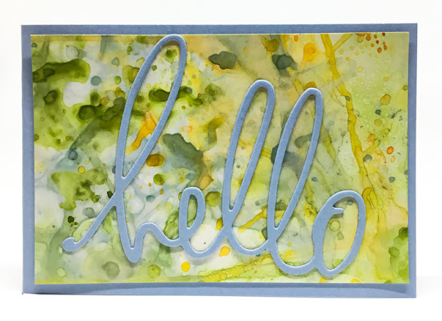
A BIG HELLO

I got this really cool "hello" die recently. As soon as I opened the package and discovered a very bold sentiment, I was immediately driven to use it in a card. I love the font and decided that I would make it the most important part -- the focal point -- of my card. Or as it turned out, cards.

What I needed was a background that was interesting in and of itself, but not so interesting that it would  overshadow my basic statement.

I love making backgrounds in a random, uncontrolled, way. So I grabbed a quarter sheet of glossy cardstock and went to work with some Stampin' Up! inks. I used Mango Melody, Seaside Spray and Granny Apple Green for my color choices. 

I ended up trimming the single piece of finished background so I got enough for two small cards. These diminutive cards measure 3" x 4 1/4". 

Using the Seaside Spray cardstock for the card base for both cards, I simply switched the color of the word from Seaside Spray to Mango Melody for the second card. 


Doing backgrounds like this is, as I said previously, very haphazard and impossible to predict what the finished product will look like. To me, that's what makes it fun.

I actually had the presence of mind to take a few photos of my process as I was going through it. 

The first photo below shows how I simply squished the three colors of ink directly from the ink pad to the craft sheet. 

The next step was to spritz each one with a mist of water until bubbles form. If you add too much water, the color will be extremely thin and not show up too much on your paper. This is especially true if you are using glossy cardstock, as I was doing.

The Granny Apple Green ended up being quite intense, so I spent a lot of time trying to balance the colors as well as I could. 

To get started, dip the glossy side of the paper into a color in a few spots. Continue with the other colors. If you want a more definitive look, dry the paper in between each color with a heat tool. Then they don't blend together as much. 

As the original puddles of ink start to get used up, you are left with little more pronounced dots of color. Those are my favorites! Look at the first card photo and you can see the little dots of color more than in the second photo. 

When picking up ink, you can even bend the paper to grab ink in selected areas. Keep examining what you have so far to determine which areas need a little more work.

The long streaks of color result when you tilt the ink on the paper as you are heating it. Not my favorite, but if you can get them to crisscross each other a few times, it can provide an interesting look. 


My final result is shown in the last photo. Often the inks will tend to puddle at the edges. Sopping it up with a corner of paper towel works to some extent. My solution for that is to simply cut your cardstock a little bigger than you want to end up with, and just trimming off the undesirable edges.

Another consideration to be aware of if you want to make a background using this technique is to be sure to select colors that play well together. I know I've said it before, but if I would have thrown a red, for example, into this mix, I would have gotten much more of a brown result in areas.


There you have it. I hope I've given you some good tidbits of advice for creating a background such as this. It just takes a lot of experimentation and willingness to accept what results, or, if not, to continue to work on it until you are happy. 

Messy
Smiles.


January 5, 2021

EVERYTHING IS STILL ROSY

Have you ever had in your hands one of Stampin' Up!'s Product Medleys? These wonders come with SO MUCH beautiful product! So much. 

Several months ago, some fellow stampers and I purchased off the CLEARANCE RACK a Product Medley called Everything Is Rosy. I just looked back, and that was almost a year ago! You can see some of the cards I originally made from this Product Medley in my Everything Is Rosy blog post.

That kit came with ever so many goodies that I don't think I'll ever be able to completely use it all up. Last week, one of the friends who ordered it with me and I got together virtually to work on some more cards using this kit.

If you do have this Product Medley in your possession (lucky you!) and would like some more ideas of what to do with the components, keep perusing this post, as I have added three more idea cards.

The papers that come in this Medley are exquisite. As I use part of a sheet, I always save whatever is left over. To make use of some of these scrappy little pieces, I ended up with the first card:


The Product Medley came with some rose gold foil paper that is gorgeous. And it embosses beautifully. I grabbed an embossing folder that has retired (darn) and ran a piece of the foil cardstock through with that folder. The results . . .

Notice the crinkly ribbon and the Night of Navy baker's twine I used in the card. They too came in the kit! Oh! As did the pretty metallic edged Night of Navy ribbon in the first card I showed you.


Another of the papers that came in the Medley was this marbeled metallic on Night of Navy. The die cut flowers, the crinkly ribbon and the foiled edge labels were also some of the components. The darling sentiment was also part of it all. 


I have loads of product still remaining, so I am sure that sometime in the future, I will have more card ideas to share with you.

Who of my readers has the Everything Is Rose Product Medley? Do you love it?

Rosy 
Smiles.


January 2, 2021

#dailycreating AUGUST 2020

In August, I celebrated two years with Terry Runyan's Facebook group, #dailycreating. For participants of Terry's group, she posts a list of suggested prompts for the upcoming week each Sunday afternoon.. While these prompts are not mandatory, for some they serve as a kickstarter for ideas. Terry is simply encouraging us to be creative in some way each and every day. At the time I did these drawings, I was following the prompts almost religiously, which often led to creative pieces that were less than wonderful -- in my eyes. That is because oftentimes a prompt here and there would not resonate with me.

Lately, however, I have found myself deviating more frequently from the prompts, giving me not always successful pieces, but often resulting in work that is a bit closer to my heart. 

Each day, we participants who choose to do so, post our day's work to the Facebook page. The group is loving and non-threatening in their comments. If a member asks for advice, the other members are sure to jump in with constructive words, always in a caring and safe manner. I find this group of artists, some professional, some mediocre (where I fall), some complete beginners, all mesh very well. I cherish them as family.

To begin a new -- and hopefully better! -- year, I will start out by sharing with you 12 of my creations for August. As always, above each piece, I will include the prompt and any other pertinent information I know about my subject matter.

 #buttons, zippers and pockets


#insects
firey jewel beetle

#thing on thing
chameleon

#repair
*kintsukuroi

#in love

#if i were a food . . .

#vest
corgi

#thing on thing
javan tree frogs

#baseball cap

#sneakers

#thing on thing
knobbed hornbill, indonesia

#fish
sea goldie, red sea

Under the prompt, repair, I noted that is was an example of kintsukuroi and added an asterisk (*). For anyone who is interested in this Japanese philosophy of repairing something broken, bringing it to an even more valuable level, HERE is a very interesting article to further your knowledge. Enjoy!

ADDITION: For any of you who find the topic of kintsukuroi, also known as kintsugi, I just discovered a fascinating video about this time honored Japanese art of preserving the past and making the "victims" of accideents even more valuable. HERE is a link to the short video.

Anyway, this brings me to the end of my little monthly exhibition of what I have accomplished in the not so distant past. Each month I will continue to bring you another installment.

I hope you don't mind that once a month I depart from my original premise for my blog, that of planting paper seedlings, in essence, giving you ideas for paper creations that will further you along your creative journey. 

Please always keep in mind that these are my own personal creations, and I appreciate that you respect that by not using my drawings for any purpose unless you do so with my express approval. If you like any of them enough, I will gladly have wonderful quality Giclee prints made for you. Just let me know.

Sketchy
Smiles.