July 30, 2017

CARD VS FRED

I intended to take the photos of the card for today's post yesterday. However, I got all tied up with other stuff, and all of a sudden, my light was gone.

Today dawned beautiful and sunny. I proceeded to set up my photo taking spot, excited about the possibility of dramatic lighting.

Change of plans:

Fred discovered the sunny window, and immediately let me know what was more important -- taking stupid card photos or a cat enjoying the sun.

Well, I guess he told me.


If cats could talk, I know he would be telling me . . . well, just look at his face. 
You know what he's trying to say to me. 
It's not nice.


Can't you just leave me alone?


Puh-leeze.


I am just ignoring you.


And, yes, I can see that you are still there.


I'm giving you the evil eye.


Maybe if I just ignore her, she'll go away.


 .. . and. leave. me. in. peace.


Ah. I just love this solitude.


WHAT!?? You are still there?!?


The evil eye is saying GO AWAY!


WAIT! WHAT??! Is that an obscene gesture??


I think he feels this is getting real old real fast.


Waiting . . . 


As long as she is keeping me awake, I might as well spiff myself up a bit.


The Sphinx


I think he's losing patience with me. And I think I am losing this battle.


I thought maybe if I moved the card into the picture, he would get the message. 


Nope.


Fred just does not care.


I give up. You win, Fred.


This is the card that was supposed to be the subject of today's blog post. 
Stay tuned. I promise it will show up on Wednesday.


Frustrated
Furry
Smiles.

July 25, 2017

HIGH FLYIN' CRACKED GLASS

 Have I got a treat for you! Have you ever heard of the cracked glass technique? It yields an antiqued look to a stamped image similar to what you see on old pottery pieces. It is referred to as crazing when it happens to decorative pieces. While this development is sometimes given a bad name, I love the look of it, and celebrate as a piece I own continues to do its crazing bit. I think it adds so much character and makes it so much more interesting to look at.

Anyway, in the stamping world, you can achieve a look similar to crazing with heat embossing. I have to admit that it is pretty much always a surprise as to the results you will get. In my sample below, obviously my cracks went more on the diagonal side. While I wasn't completely happy with it, I went with it anyway.


When I had finished doing the cracked glass technique, I wanted it to look a little more antique-y, so I sponged Early Espresso ink over the cracked areas to try to force some brown ink into the cracks. Following is my final piece.

I must note, however, that I used a recycled cardstock with specks of color in it, so that is what shows up in the background.


When I finished my hot air balloon cracked glass piece, I incorporated it into a greeting card. 


Before I started with the embossing, I used my Prismacolor pencils to color in the balloon.

Below is another view of the cracking.


A look at the finished card:


Lots of crazy crazing goin' on, eh?


This is how you proceed in doing the cracked glass technique:

After your image is stamped and colored as desired, cut the piece to the size you want it to be in the finished state. Completely cover the stamped piece with VersaMark ink. At the heat station, cover it with a thick clear embossing powder. I used some of my retired Stampin' Up! Glassy Glaze Enamel (See? Don't ever get rid of your goodies!) But, you can also use Ranger's Ultra Thick Embossing Powder. It is also possible to do this technique with regular clear embossing powder, but it takes layers and layers and layers of embossing in order to get the surface thick enough to crack.

OK. Back to the first layer of thick embossing powder. Heat emboss this. If you are quick and your piece is still hot, you can add another layer of embossing powder and heat that. If it cools down too much between layers of embossing, add more VersaMark ink, then more embossing powder. To get the results I did, it took five layers of Glassy Glaze Enamel. I watched a video where the demonstrator was using regular clear embossing powder, and it took ELEVEN layers to get it thick enough to crack. That's why it is so much less time consuming to use embossing powder that is thicker and more granular in the first place.

Once you have four or five layers of embossing, and the piece is shiny, smooth and has some nice thickness, place it in the freezer for five minutes. As soon as you remove it from the freezer, bend the piece until you hear cracking. Turn the piece so all the cracks don't run the same direction. It is possible to overdo the cracking, and pieces might crack and flake off and ruin your piece. Ask me how I know that's possible.

If, after putting the embossed piece in the freezer, it still doesn't crack, add another layer or two of the embossing powder before putting it back in the freezer for another five minutes. Then try to crack it. 


If you would like to watch Beate Johns in action doing this technique, you can access it HERE

Have fun! This is such a great -- albeit a bit time consuming -- technique that never fails to WOW!

Cracked
Smiles.


July 23, 2017

THOUGHTFUL FLOATING REINKERS FLOWERS

 The Floating Reinkers Technique requires stamps with wide open spaces, like those in the set I used:


Looking through the new Stampin' Up! catalog, there are many many sets that include stamps that would work wonderfully for this technique. 

These include the Soft Sayings Card Kit on page 11 (I am holding a class with this kit on August 16!), the trellis-like stamp in Hello Friend (page 17), the orchid components in Climbing Orchid (page 21), the large stamp in Flourishing Phrases on page 24, the line drawing stamps in Flirty Flowers, page 25, three of the flowers in Flower Shop (page 28), the lovely roses and leaves from Graceful Garden on page 57, as well as the flowers from Birthday Blooms (page 70), the flowers and leaves in Birthday Blossoms on page 80, even the tree stumps of Always & Forever, page 89, the GORjus flower from You've Got This on page 101, the Vintage Leaves on page 125 would be lovely, as would the images from Basket of Wishes on the same page, the flora shapes from Remarkable You (page 142), the leaves and flowers from Rose Wonder on page 162, as well as the pretty roses in Floral Statements on the next page. You could even have a lot of fun with the logs in Tree Rings, found on page 164! 


I, of course, used the very appealing set, Falling Flowers, on page 143, for my card. I LOVE this set!!


Another crucial component you need in order to do this technique is Shimmery White Cardstock, which can be found on page 194. Even though this paper is a little more pricey, at 80 cents per sheet, you find yourself being a bit more careful when cutting just the size piece you need for your creation. With caution, your 10-sheet pack can last a long time!


With this technique, if any of the color extends beyond the stamped and embossed edges, simply fussy cut it, or, in this case, use the coordinating die to cut it out, and use it that way! (Even though I do have the dies for this set, I did fussy cut my flowers.)


You can see in a few places where the color on my card did not always stay where it belonged. Hey, that doesn't bother me in the least. If I hadn't pointed it out to you, you probably would not have even noticed it.


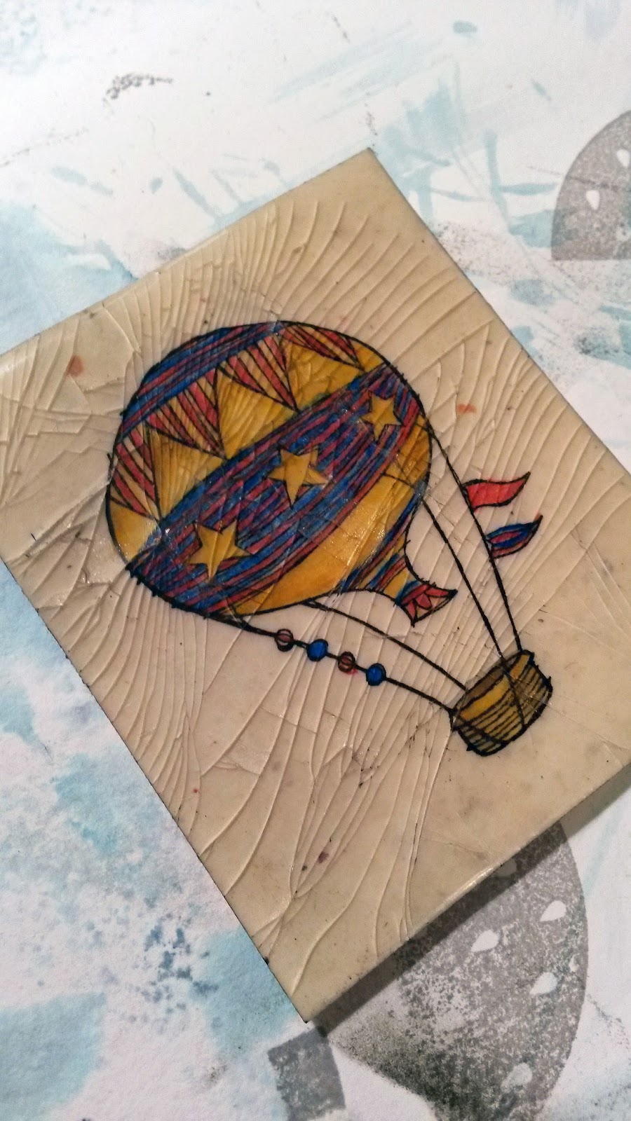
Another product that is essential to do this technique properly would be reinkers. As you can see, I've used an assortment of blues, greens and oranges for my creation. Put a drop or two of each reinker in the spaces of a plastic paint palette and pick it up with an Aqua Painter.


Once your images are stamped in VersaMark ink and heat embossed in white, spritz the design with water, and drop those reinkers within the lines -- and watch the magic occur!


One word of admonition, when doing the Floating Reinker Technique, is to be very careful that you aren't letting any ink stay in one place too long. It becomes concentrated and leaves an unsightly darker blotch of color that sometimes cannot be fixed. So, make sure your images are adequately wet and keep those inks gentle and moving.


I love the added dimension that a fussy cut image can provide to another area of a card with the simple use of Stampin' Dimensionals


 Adding some color coordinated Washi Tape underneath the sentiment label finishes it off admirably.


If you'd like to give this oh-so-appealing technique a try, you can find the complete tutorial for it HERE. Have fun! It is a technique you will find yourself going back to time after time after time! 

And, I've given you lots of current sets that would work well for the Floating Reinkers Technique.

Floating
Smiles.


July 19, 2017

BIRTHDAY SQUIGGLES

The jury is still out on how I feel about this year's new In Colors: Berry Burst, Fresh Fig, Lemon Lime Twist, Powder Pink and Tranquil Tide. Meh. If I had to choose a favorite -- or two -- I guess I would pick Tranquil Tide and/or Fresh Fig. Not a fan at all of neon colors, to me, the Lemon Lime Twist falls into that category. The Berry Burst is, in my eyes, a combo of Rich Razzleberry and Melon Mambo. The Powder Pink -- well, it's just too much akin to Blushing Bride and Pink Pirouette, neither of which I use very often at all. So, I don't need another soft pink.


I had a Stamp-In workshop last Monday, and since I was in love with the new Happy Birthday stamp in the catalog (Stylized Birthday on page 80), I wanted to feature it in one of my workshop cards. I also wanted to play with some of the new In Colors.


 In tandem with the Swirly Scribbles Thinlits (page 216) and the four most jewel-like tones of the In Colors, I came up with a project that pleased my senses enormously.


To incorporate a little more of the richness than just the jewel tones of the papers, I embossed the sentiment in gold. 


Following is a tutorial of how to build one of these cards for yourself to give to some lucky birthday male or female:

SUPPLIES:
Stylized Birthday stamp (page 80)

Very Vanilla cardstock
Black cardstock
Berry Burst cardstock
Fresh Fig cardstock
Lemon Lime Twist cardstock
Tranquil Tide cardstock

VersaMark ink

Big Shot
Swirly Scribbles Thinlits
Embossing Buddy
Heat Tool
Gold Embossing Powder

INSTRUCTIONS:
Fold  a 5 1/2" x 8 1/2" piece of Very Vanillla cardstock in half, creasing well with a bone folder.

Rub a 4" x 5 1/4" piece of Basic Black cardstock well with the Embossing Buddy. You don't want any stray dots of gold embossing lurking! Stamp "Happy Birthday" in the center of this piece in VersaMark ink. At the Heat Station, add Gold Embossing Powder to the stamping, tapping the excess powder back into its container. Use the Heat Tool to emboss the image.

Using the long Swirly Scribbles Thinlit, cut one of each of the four In Colors. Add the swirly shapes to the edges of the black piece so the sentiment in the center is completely visible. Do a little planning in putting the diecut pieces on. Use glue sparingly and be fairly confident about the placement. Excess glue on the black is hideous and very difficult to remove. Once you have your diecut pieces adhered to the black piece, adhere this entire piece to the card base.

At this point, use scissors to trim off any excess swirls that extend beyond the edges of the card. At certain points, you may have to add a bit of glue to hold it in place because your trimming may create some strange and straggly ends.


Squiggle-y
Smiles.