June 28, 2022

TRIPLE TREAT

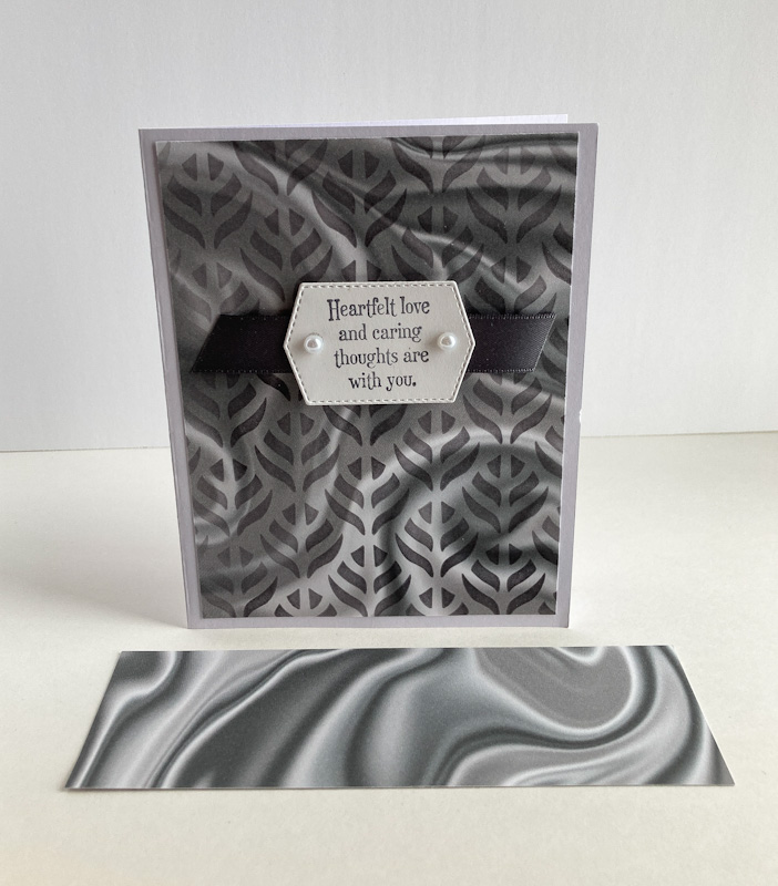
I'm not sure if I invented this take on a well-known technique or not, but using Designer Series Paper this way just popped into my head.

Not even aware of what this particular triple layered technique is called, it is usually done with stamping on the three layers. I decided to skip the stamping step and utilize the beauty and versatility of Designer Series Paper. And this is how it looks: 


I opted to adhere the layers flat on top of each other. The only dimension comes from the popped up sentiment layer with its folded over White Flax Ribbon.


I actually tried several different combinations of DSP with the black layer. They all looked great, but I was most taken with this particular combo.


Following is an easy tutorial on how to pull off this look.

SUPPLIES:
Your choice of Designer Series Paper
A neutral card base  
Black cardstock

All Squared Away stamp set (retired)

Black ink

Die cutting/embossing machine
Layering Circles Dies (page 172, Annual Catalog)
White Flax Ribbon
Stampin' Dimensionals

DIRECTIONS:
Cut a 5 1/2" x 8 1/2" card base of neutral cardstock. Fold it in half, creasing it well with a bone folder. You will be building your layers on top of this, so you will only see the inside and the back of this cardstock.

From your selection of Designer Series Paper, cut three pieces that measure: 2 x 3 1/4", 3 x 4 1/4" and 4 x 5 1/4". 

From black cardstock, cut three pieces that measure: 2 1/4" x 3 1/2", 3 1/4" x 4 1/2" and 4 1/4" x 5 1/2".

Layer these pieces all together, going from the largest to the smallest. When they are all glued together, stack them in the same order, gluing them.

When all three layers are together, adhere the whole piece to your neutral card base. Unless you were very very accurate in your cutting, you may need to trim a bit at the edges.

On a scrap of white cardstock, stamp a sentiment that fits well inside a 1 3/8" circle in black ink. Use the 1 3/8" die from Layering Circles to cut out the sentiment. From the same die set, use the scalloped die as a mat for the white circle. Adhere these together.

Fold a 6" piece of white flax ribbon in half, snipping the ends to angles and adhere this to the back of the circles, with the folded portion extending above the sentiment.

Use Stampin' Dimensionals to add this to the card front.


Triple 
Smiles,


June 25, 2022

ANNIVERSARY BOUQUET

I used components from two different past Paper Pumpkin kits to create this anniversary card for my husband.

With few exceptions, Paper Pumpkin kits are versatile and loads of fun. And Stampin' Up! is so generous with their supplies in these kits that you always have lots left over to play with in other projects.


The Paper Pumpkin components I used in my card are the gorgeous tone on tone vellum in the background, as well as the adorable bouquet stamp. 

After stamping the bouquet in Memento Tuxedo Black ink, I used Stampin' Blends in: SU 500 (one of their new neutral colors), Dark Pale Papaya, Dark Pink Pirouette (retired, but I still use it on occasion), Dark So Saffron, Light Parakeet Party (a new In Color!) and Dark Granny Apple Green, a color I grab frequently.

I fussy cut the bouquet, leaving a narrow white edge all around.

The pretty backdrop for the bouquet was cut with one of the Stitched So Sweetly dies. It was the perfect shape and size to set off the flowers just right.


I completed the look with a looped piece of Bumblebee Gingham Ribbon. 


If you're a Paper Pumpkin subscriber, do you make sure you use up all the supplies that come with the kits? How do you store your supplies until you are ready to use them?

Leftover
Smiles.


June 21, 2022

BETTER DAY

If you've been reading my blog, Paper Seedlings, for any length of time, you've probably already read about a catastrophic disaster that befell my husband and me several years ago.

In case you have never enjoyed this story, here it is:

Before we moved to our present house, which is located in a neighborhood, we lived in our dream house that we designed and built on about ten acres of wooded land. Very rural. Very beautiful. Our sanctuary. 

With the help of a local landscaper, we had wonderful landscaping done on the sloping terrain at the back of the house. Part of this beauty was a waterfall. At the top was a small pond, and from there the water cascaded over ledges of rocks downwards. It was so beautiful. 

The pond at the top was so serene, with its water plants in and around the water, we decided we would add a few koi to the pond. 

Living in Wisconsin, we, of course, could not leave them outside for the winter. So, we invested in a large aquarium with filtration, etc., in which they could live in comfort throughout the cold months. In that way, one of the koi that we had purchased at only about 4", grew until he was a gorgeous monster about a foot and a half long, with beautiful black, orange and white coloring. He was my spoiled baby. There were a couple others in there too, but this was my special one.

About 1:30 in the morning one summer, we woke to a racket outside. My husband grabbed a flashlight (brave man) and went out to see what was going on. When, what to his wondering eyes should appear, was a fat raccoon running away into the woods and fish heads lying on the ground by the pond. And nary a live koi in sight.

So, when people talk about how adorable raccoons are, I think to myself, yeah, they're cute -- in looks. Those vicious assassins. 

So, when Stampin' Up! came out with the cute set Wild and Sweet (page 87 in the Annual Catalog), I decided to  pair the raccoon up with one of the koi from a retired set.


I snipped open the greedy little cuy's mouth and added an approximation of my beloved koi. Grrr.
I fussy cut both the raccoon and the fish, and added them to some weird grass (because the raccoon's feet looked funny when fussy cut outside the context of the rest of the stamp).


I cheekily added a cheery "Happy Father's Day" at the bottom of the card. BUT . . . 

Inside the card, I wrote "Hope your day is better than this koi's." 

While my husband is usually sort of nonresponsive to my creations, he loved this one. We both had a good laugh over it.

Editor's note: We never replaced our koi. Sad, but true story.


Killer
Smiles.


June 18, 2022

BUTTERFLY THANKS

Do you like the squiggly background on this card? Ir is made with something very unexpected. Read on to see what I used to get this effect.


To tell the truth, this card was entirely based on the background. Once I deccided to use what I did, I planned the rest of the card. It fell into place pretty easily. And is a cinch to make.


The raised butterfly wings, and the jewel on the butterfly's body, plus the "thanks" raised a bit with Stampin' Dimensionals, give this card a modest amount of dimension. Just enough to make it interesting.


A closeup of the main components of the card. Use your imagination. 
Do you have any idea whatsoever what I used to "stamp" the background? No?


Here's a tutorial. Enjoy!

SUPPLIES:
White cardstock
Bermuda Bay cardstock
Mango Melody cardstock

Coastal Cabana ink

Die Cutting/Embossing Machine
Amazing Thanks dies (page 169, Annual Catalog)
Brilliant Wings dies (page 169, Annual Catalog)
Blue Gems
Mini Stampin' Dimensionals
and . . . .
are you ready?
A soap holder
Yes!

DIRECTIONS:
Fold a 5 1/2" x 8 1/2" piece of white cardstock in half, creasing it well with a bone folder.

Add to this card base a 4" x 5 1/4" piece of Mango Melody cardstock. 

You probably don't have anything like this, but, then, maybe you do. I used a weird soap holder that was like all sorts of tiny rubbery worms smooshed together. I used this as my "stamp for the background. I inked it up with Coastal Cabana ink, then "stamped" it firmly in the center of this piece of white cardstock.

From Bermuda Bay cardstock, die cut one of the smaller butterflies from the Brilliant Wings die set. Add a rhinestone to the center of his body. Set him aside briefly.

From Mango Melody cardstock, die cut the non-detailed portion of the thanks, and from Bermuda Bay cardstock, cut the detailed part. Carefully adhere these two pieces together.

Lay both your butterfly and the "thanks" onto your card until you are satisfied with the arrangement. Use Stampin' Dimensionals to attach the "thanks" in place. Add the butterfly with adhesive only along the butterfly's body. Gently tip the butterfly's wings upwards.


More proof that you should always keep your eyes open for things that are not normally used for stamping. Think of all the possibilities! Remember: nearly everything can be used as an art supply in some way.

Soapy
Smiles.


June 14, 2022

FLORAL NAPKIN

Are you ever in a store and spot a package of napkins that just seems too beautiful to just wipe your mouth on or to sop up food? This very thing has happened to me countless times. Maybe that explains why I have several packs of pretty napkins in my stash. Remember? Everything is a potential art supply! Right?

Recently, when I spotted this really old-fashioned looking pack of flowered napkins, I simply had to have them. Luckily I was at Dollar Tree, so they didn't cost very much.

Read on to discover how you can make the most of a pretty napkin.


Making your napkin base is the fussiest part of this card. But, even so, it is easily accomplished. Doesn't it look elegant?


Once your napkin base is finished, of course, you will want to preserve the prettiness as much as possible. So, like I did, simply adding a small sentiment with a bit of bling is all it needs.


Here's how you do it:

SUPPLIES:
A neutral cardstock for the card base
A light-colored cardstock to which the napkin is adhered
Garden Green cardstock (to match this particular napkin)
The TOP PLY of a napkin.

Garden Green ink

Quiet Meadow stamp set (page 68, Annual Catalog)

Die Cutting/Embossing Machine
Seasonal Labels dies (page 174, Annual Catalog)
Iridescent Rhinestones (page 142, Annual Catalog)
Glue Stick
Stampin' Dimensionals

INSTRUCTIONS:
Fold a 4 1/4" x 8 1/2" piece of cardstock that matches the napkin you are using for this project in half, .  creasing it well with a bone folder.

Carefully peel off only the top ply of a decorative napkin. If you have trouble getting the process started, rub one of the corners well with your bone folder. This will release the area where the layers are fused together. Move slowly when separating the layers so as not to tear the napkin.

Cut a base piece of white cardstock that measures 3 3/4" x 3 3/4". Crumple up the napkin in your hand, and flatten it out slightly, but not completely. Do this process 3-4 times, retaining attractive creases and wrinkles. This is what gives your creation character.

Use a glue stick to cover one side of the base cardstock, corner to corner and edge to edge. This is important! Gently center the back of the napkin to the glued cardstock. Without flattening the napkin, carefully press all over it so you retain the wrinkles. When you are finished pressing it in place, secure the edges to the back of this piece, mitering the corners neatly.

With the napkin I used, Garden Green coordinated well, so I adhered my napkin covered piece to a 4" squaare of this cardstock.

Add this to the card base.

On a scrap of your card base color, stamp in coordinating ink a sentiment. Die cut this with a die that works with the size of your sentiment. I used a die from the Seasonal Labels Dies.

Add it to the lower right of the card with Stampin' Dimensionals.

Add two Iridescent Rhinestones to either side of the label.


Have you ever tried this technique before? Now, that you see how to do it, will you give it a try?

Crumpled
Smiles.


June 11, 2022

HEARTFELT LOVE

I actually created this card awhile ago, but forgot all about it. I came across it today and felt I really should share it with you because I like the method used in creating the background.


Do you remember the freebie that you could earn during the last Sale-A-Bration, a pack of Designer Series Paper called called Simply Marbleous? Coming in several colors, I wasn't a crazy fan about the side that resembled an oil slick or sumptuous silk. I sort of liked the flip side that was kind of a smoky look. 

Shown in the photo below is a snippet of the DSP the way it looked coming out of the pack


To supposedly "improve" the looks of the design, I used a Decorative Mask, which is now retired, but you can find the new set of Decorative Masks on page 129 of the Annual Catalog. 

Using Basic Gray ink and a Blending Brush, I transferred the design to a 4" x 5 1/4" piece of the gray DSP. 


I thought the stenciling made the DSP look a little more interesting and classy. To preserve the looks of the "new" paper, I decided to let it be the star and added very little to it.

The beautiful sentiment is from the Quiet Meadow stamp set (page 68, Annual Catalog). The sentiment is on a label die cut with one of the Tasteful Labels dies, which, after searching the Catalog, I guess is retired. So sad. I use that set of dies a lot, and will continue to do so.


To embellish the sentiment a bit, I added Basic Gray satin ribbon behind the label, and two light gray pearls to the label itself.

Have you ever tried any of the Decorative Masks? Did you ever use them over Designer Series Paper? Do you like the look of it? When using a mask (stencil), what do you use to transfer the ink? Have you given the Blender Brushes a try?

Masked

Smiles.


June 7, 2022

PLENTIFUL PLANTS

There are a couple of cool things about this particular blog post. 

The first thing is that this is POST #1111! <insert a little squeal here!> Not knowing what I was doing way back in September 2012, when I first launched Paper Seedlings, my posting schedule was a little erratic. What?! What I just said implies that I DO know what I'm doing now. Not really. Although I have become religious about posting each and every Tuesday and Saturday. I'm still fairly clueless about this computer business. 

Initially, when I started Paper Seedlings, my intent was to plant little creative paper ideas into my readers' brains. To this day, that is still my intent, never having deviated from that original plan. With each post I write, I hope to instill ideas that you may have already known, but forgotten, to teach you something new, whether it's a technique or a different way of looking at things, OR how to use what other "normal" people would consider garbage (gasp!) in your papercrafting. 


The card I feature today has maybe a little different look from what you're accustomed to seeing from me. But, I love the fresh and modern feel of it. I hope you do too!


The precious plant in its terra cotta pot is from the Plentiful Plants stamp set, found on Page 63 of the Annual Catalog. Not only does the set boast some cool plants and coordinating pots, but also some really useful sentiments. Check it out!


Not a lot of dimension, I almost think you could get away without additional postage to mail it. Love that!


Here's a quick tutorial on how to make a card similar to this.

SUPPLIES:
White cardstock
Soft Succulent cardstock
Cajun Craze cardstock
Woodgrain Designer Series Paper

Cajun Craze ink
Shaded Spruce ink

Plentiful Plants stamp set (page 63, Annual Catalog)
Through It Together stamp set (page 69, Annual Catalog)

Die Cutting/Embossing Machine
Tags dies
Beautiful Shapes Dies (page 169, Annual Catalog)
Silver Metallic Pearls
Paper Snips
Stampin' Dimensionals

INSTRUCTIONS:
Fold a 5 1/2" x 8 1/2" piece of white cardstock in half, creasing it well with a bone folder.

To this card base, add a piece of Cajun Craze cardstock that measures 3 3/4" x 5".

From a woodgrain Designer Series Paper, die cut a banner that measures 2" x 3 3/4". With a smaller banner die that measures 1 1/8" wide, cut another from Soft Succulent cardstock. Adhere the smaller banner to the back of the larger banner, leaving about 3/4" extending at the bottom.

Add the baanners to the card front about 3/4" from the top of the Cajun Craze and about 3/8" from the left edge.

On a scrap of white cardstock, stamp the pot in Cajun Craze ink, and the snake plant in Shaded Spruce ink. Fussy cut these two pieces, leaving a white border all around.

From Soft Succulent cardstock, die cut a hexagon that measures 2 1/4" across. Using Stampin' Dimensionals, adhere the plant in the pot onto this hexagon, lining up the plant with the top of the pot. Add three silver metallic pearls around the plant.

Adhere the finished hexagon to the card with Stampin' Dimensionals.

On a piece of white cardstock measuring 1/2" x 2 1/8", stamp the sentiment in Shaded Spruce ink.

Use Mini Stampin' Dimensionals to add the sentiment to the lower right corner of the card.


Plentiful
Smiles.


June 4, 2022

#dailycreating JANUARY 2022

Today I will share with you a selection of drawings I did from January 2022 as part of Terry Runyan's Facebook group, #dailycreating.

Terry encourages all of her members to try to create something each day. 

It was in January that I sort of started to fall apart a little bit. Struggling with my drawing and staying creative in any way became the norm. And it was scary. Searching for something to pique my interest, I came across a "new" sort of art called Neurographic Art

The more I learned about this type of art, first developed in 2014, the more I became convinced that it could help me pull myself together again. Or, at least, it seemed that it could be a great stress reliever. You will find among these drawings the first of this type of art I've tried. I will have them labeled as such:

Meanwhile, I will note above each drawing what the prompt was for the day and any other interesting information I have found on my subject matter.

#bird-urday

green macaw


off prompt
chestnut-bellied malkoha/singapore

#fish-urday
peppermint angelfish/pacific ocean

#blue
blue jay

#thing on thing
great kiskadee/texas to argentina

off prompt
my take on neurographic art

#thing on thing
female northern cardinal

#squirrel appreciation day
#squirrel-urday

off prompt
another take on neurographic art

#thing on thing
boar-billed heron/mexico-south america

#emu-urday

When I say "my take on neurographic art", this type of art has so many parameters that need to be met in order to be considered "true", so I always just say that mine is based on neurographic art. Since I did these two pieces, I have managed to finish countless more, each one more different than the last. In the coming months, I will be sharing more of mine with you. In fact, I have several framed pieces of this art for sale in a local shop. I find it ever so soothing to work on. Whenever I need to calm down a bit, I work on a piece for about 15 minutes. That's about all my hands and eyes can take in one sitting.

Also, #thing on thing. I have said this every month, but for new readers, I will give an explanation. Terry designates every Wednesday as #thing on thing. While some take that more literally, I really don't so much. In fact, Terry herself always creates a painting of a cat on a head. I, on the other hand, find a bird that has something special added to his head or beak. This I call my #thing on thing.

Finally, the #-urday notations. Terry originally called Saturdays #caturday, but, since not everyone is a cat lover, she extended it to #dogurday, which gradually became either of those two or any #animal-urday. Which is why you see that above some of my drawings.

Please respect that these are my original pieces of art and cannot be reproduced or used in any way without my express consent. I have prints available if you are interested. Just let me know.

#dailycreating
smiles.